JSNA 2023 home page Dashboard user guide Contents page
Mortality
Mortality rates are important measures of public health, and deaths are extremely well recorded. Mortality rates are influenced by a very broad range of factors, including but not limited to living circumstances including deprivation, environmental factors, health behaviour, and access to healthcare and quality of care.
Mortality rates give the number of deaths per 100,000 population so that it is possible to compare areas of different sizes, and look changes over time in a single area when the population size changes. However this can be misleading if the age structure of populations varies. Age standardisation of rates is a further step to take into account differences in the underlying age structure of a population, which allows direct comparison between areas, as well as over time. Without age-standardisation, areas with an older population such as rural areas would have much higher mortality rates than areas with a younger population such as cities and comparisons would not be fair.
We have three separate mortality dashboards; the first presents the most recent data, the second looks at what proportion of deaths is caused by which conditions, and the third dashboard presents historical trend data and health inequality data. Please note that the most recent data should not be compared with the historical trend data because the data used to calculate rates is not quite the same and comparisons of the most recent data and historic data may be misleading – see the note on rate calculations below for more information.
The dashboard containing the most recent measures uses population data from the 2021 Census and as such the values for rates are likely to be more accurate. We will discuss the most recent data first and then look at trends.
Open this dashboard as a new page
It may be easier to open this dashboard in a new page. If the visualisations do not look as you expect them to, or if the required option is not visible, please press the ‘reset filters’ button at the top of each page. For more information see the JSNA User guide.
All cause mortality: recent data
Page 3 of the dashboard shows all age all cause mortality rates and represents all deaths in a single measure. Fenland and Peterborough have statistically significantly higher rates than the combined Cambridgeshire and Peterborough average, as well as the England rate.
Within Cambridgeshire and Peterborough there are substantial differences in all age all cause (AAAC) mortality rates. In 2021, higher rates were seen in our more deprived areas – Fenland and Peterborough, which are significantly worse than the England average. Our other areas, and Cambridgeshire as a whole, have significantly lower (better) rates than the England average and the lowest rate was seen in South Cambridgeshire.
Main causes of mortality: recent data
It may be easier to open this dashboard in a new page.
Page 4 of the dashboard compares 2021 all-age mortality rates from common causes of death across our areas, with the option to view rates by sex. Cancer and cardiovascular disease are the most common cause of mortality. Page 3 of the dashboard allows the user to look in more detail at a wider range of causes of death – these are grouped by broad categories. The ‘Other’ category includes child and infant mortality, drug misuse, communicable disease (which includes flu but excludes COVID-19 deaths), suicide, injury, and deaths attributable to smoking.
In general, Peterborough and Fenland have higher death rates from the common conditions but this is not universal. For example, the female cardiovascular mortality rate appears higher in Cambridge than in Peterborough, and Cambridge males have similar cancer mortality to Peterborough, though confidence intervals are wide, indicating relatively smaller numbers. Rates of death from dementia were higher in Cambridge than in all our other areas and were higher than the England average, though again the confidence intervals are wide. South Cambridgeshire generally has the lowest mortality rates from the common conditions shown here.
Deaths from COVID-19 in 2021 were generally higher for men than for women, and for both sexes rates were higher in Fenland and Peterborough than elsewhere in our area. In our other areas, COVID-19 mortality was significantly lower than the England average in 2021. Unfortunately, we are currently not able to show COVID-19 mortality for 2020 alongside 2021 data because the population data for 2020 (the denominator for the rates) is under revision.
Under-75 mortality: recent data
It may be easier to open this dashboard in a new page.
The dashboard also shows mortality rates in the under 75s for 2021 (see the summary on page 5, and more detailed options on page 3). This is also known as ‘premature mortality’ which should not be taken to mean that deaths in people aged 75 and over are less important.
Beginning with all-cause mortality, under-75 rates are much lower than the all-age rates described above but we see a similar pattern as all cause mortality across our districts and cities, with Fenland and Peterborough higher than our other areas and significantly higher than the England average. Again, under-75 all cause mortality in our other areas is significantly better than the England average with South Cambridgeshire experiencing the lowest rate.
Comparing our areas to their statistical neighbours for rates of all cause mortality in under 75 year olds, our districts and cities tend to be at the lower (better) end of the range, except for Fenland which is higher than most comparator areas.
Page 5 of the dashboard presents data on some of the main causes of death in people aged under 75. Similar to all age mortality, the most common causes of death in people under 75 were cancer and cardiovascular disease. COVID-19 deaths and respiratory disease deaths were relatively low in comparison with rates for all ages.
Preventable mortality
It may be easier to open this dashboard in a new page.
Page 6 presents data on preventable mortality in the under 75s. Preventable mortality are those deaths which could potentially have been prevented by public health interventions. For example, cancer deaths attributable to asbestos exposure, or liver disease deaths attributable to alcohol use. The Office for Health Improvement and Disparities summary here says “The basic concept of preventable mortality is that deaths are considered preventable if, in the light of the understanding of the determinants of health at the time of death, all or most deaths from the underlying cause (subject to age limits if appropriate) could mainly be avoided through effective public health and primary prevention interventions.”
Across Cambridgeshire and Peterborough as a whole, preventable mortality in the under 75s was 148/100,000 and nearly half (47%) of deaths in the under 75s were considered to be preventable. Nearly all liver disease deaths under 75 were from causes considered to be preventable, as were over half of respiratory deaths (please note COVID-19 is included as a preventable cause of respiratory death). Over a third of cancer deaths (39%) and CVD deaths (39%) were considered to be preventable, in line with England as a whole.
Fenland has the highest preventable premature mortality rate at 197/100,000, closely followed by Peterborough at 195/100,000.
Inequalities in adult mortality
It may be easier to open this dashboard in a new page.
Data on all age all cause mortality and preventable premature mortality is available at small area level; the Local Health dashboard opens in a new page and allows users to see shaded maps using these indicators (page 2).
Please note these maps show the age-standardised mortality ratio (SMR) for the small areas; a different measure from rates which we present elsewhere. An SMR of above 100 indicates that there were more deaths than expected in comparison to the same time period in England as a whole, and an SMR under 100 indicates fewer deaths than expected. SMRs should not be compared to each other and so this indicator is not available to plot against deprivation scores in page 5 of the dashboard. For more information on SMRs see this briefing (link will download a pdf document).
The maps show that mortality ratios vary considerably across our small areas; for all age all cause mortality there are areas with SMRs well in excess of 100 and these are not restricted to the cities and towns. The pattern for preventable premature mortality is more clearly linked to towns and cities, with the highest SMRs in areas of Cambridge, Huntingdon, Peterborough and Wisbech.
Child mortality
It may be easier to open this dashboard in a new page.
Page 3 of the dashboard includes data on child and infant mortality (under the ‘Other’ category). While child deaths are thankfully rare, the most recent data shows that rates in our area are statistically similar to England and the East of England as a whole. Confidence intervals around child and infant mortality are wide, but infant mortality in South Cambridgeshire and across Cambridgeshire as a whole is significantly lower than the England average. Fenland has the highest rate of infant mortality locally but very wide confidence intervals mean that it is not significantly different to England’s overall rate.
Proportions of death: Main causes of all-age mortality
The Mortality Proportions dashboard cannot currently be published but the key points are summarised here. We are able to analyse patterns of deaths from many different causes and are working to resolve difficulties in sharing this information more widely. Please contact us if you would like more in-depth information about the leading causes of death and how they have changed over time.
Figure 1: Leading causes of death as a proportion of all deaths in Cambridgeshire and Peterborough, male and female, all age
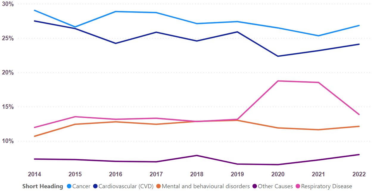
Figure 1 shows how the main causes of death in the whole population have changed over time since 2014. Please note that ‘mental and behavioural disorders’ deaths are almost all due to Alzheimer’s disease or other dementia, and also please note this chart does not represent all deaths as some causes were excluded for clarity. The most significant shift is a clear increase in the proportions of deaths due to a respiratory cause, with 2020 and 2021 showing large increases due to COVID-19 deaths. Correspondingly, the proportion of deaths due to CVD, cancer and mental and behavioural disorders fell between 2019 and 2020.
The proportion of deaths due to cancer and CVD were both falling gradually over time prior to 2020.
Figure 2a: Leading causes of death as a proportion of all female deaths in the district and city areas of Cambridgeshire and Peterborough, 2022 only.
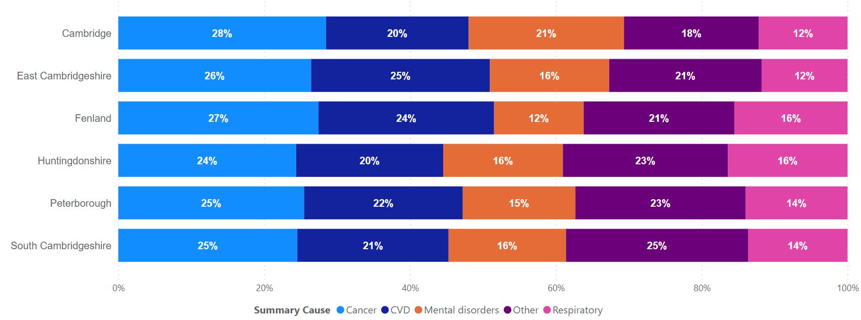
Figure 2b: Leading causes of death as a proportion of all male deaths in the district and city areas of Cambridgeshire and Peterborough, 2022 only.
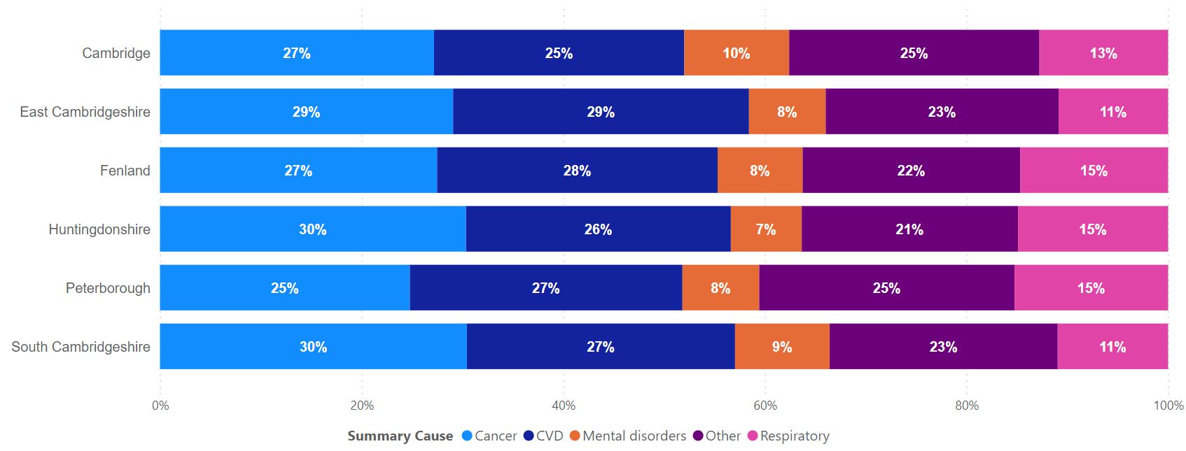
Figures 2a and 2b do include all deaths, and show how the proportions of deaths due to the main causes varied by sex and across our areas in 2022. There were proportionately more female deaths from ‘behavioural and mental disorders’ (nearly all dementia deaths) and this is likely to be due to women’s longer life expectancies. The main causes of death were quite consistent across all our areas.
Inequalities in mortality
The Historic Mortality dashboard cannot currently be published but the key points are summarised here. We are able to analyse patterns of deaths from many different causes and are working to resolve difficulties in sharing this information more widely. Please contact us if you would like more in-depth information about mortality rates and how they have changed over time.
All-age, all-cause mortality varies considerably with deprivation. Areas in Cambridgeshire and Peterborough with the highest levels of deprivation (quintile 1 or the green line in Figure 3 below) have much higher rates of mortality than areas with the lowest levels of deprivation (quintile 5, red line); rates are nearly 50% higher in the most deprived areas. There is a clear gradient in mortality linked to deprivation.
Figure 3: All age all cause mortality for Cambridgeshire and Peterborough, all persons, by quintile of deprivation.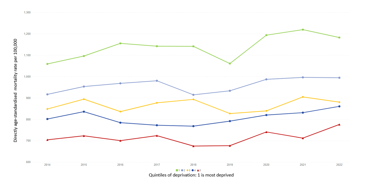
The pattern remains across all major causes of deaths, and the relationship is strongest with deaths from cardiovascular disease and respiratory disease. The relationship with deprivation is even stronger for premature (under 75) mortality, when the rates for all cause mortality in the most deprived areas are over double the rates in the least deprived areas (see figure 4).
Figure 4: Premature (under 75) all cause mortality for Cambridgeshire and Peterborough, all persons, by quintile of deprivation.
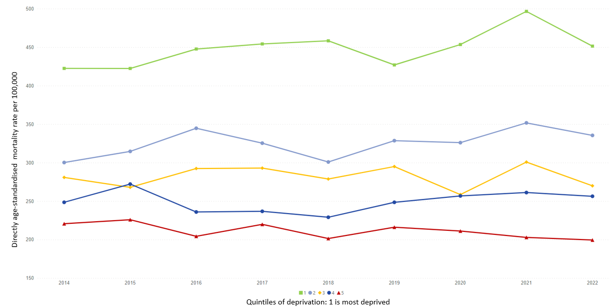
The strength of the relationship between all age all cause mortality and deprivation has remained more or less constant over time. However, in the case of deaths from cardiovascular disease, the relationship has strengthened: inequalities linked to deprivation in cardiovascular deaths have steadily worsened over time between 2014 and 2022.
Ward-level rates for all-age all-cause mortality and for disease-specific mortality, as well as premature mortality, have been calculated and we hope to be able to share this soon.
Historic mortality data
The Historic Mortality dashboard cannot currently be published but the key points are summarised here. We are able to analyse patterns of deaths from many different causes and are working to resolve difficulties in sharing this information more widely. Please contact us if you would like more in-depth information about mortality rates and how they have changed over time.
Figure 5 below shows all age all cause mortality rates over time for each of our areas. The impact of COVID-19 is clear with rises in all areas between 2019 and 2020. Fenland and Peterborough are consistently higher than our other areas, due in part to the higher deprivation in these areas. Fenland and Peterborough’s rates were similar until the most recent year of data (2022) when Fenland’s rates fell back to pre-COVID-19 levels but Peterborough’s remained high. Mortality rates in Cambridge, Huntingdonshire and South Cambridgeshire have also remained high with South Cambridgeshire’s 2022 rate actually considerably higher than 2020 and 2021.
Figure 5: Trends in all-age all cause mortality
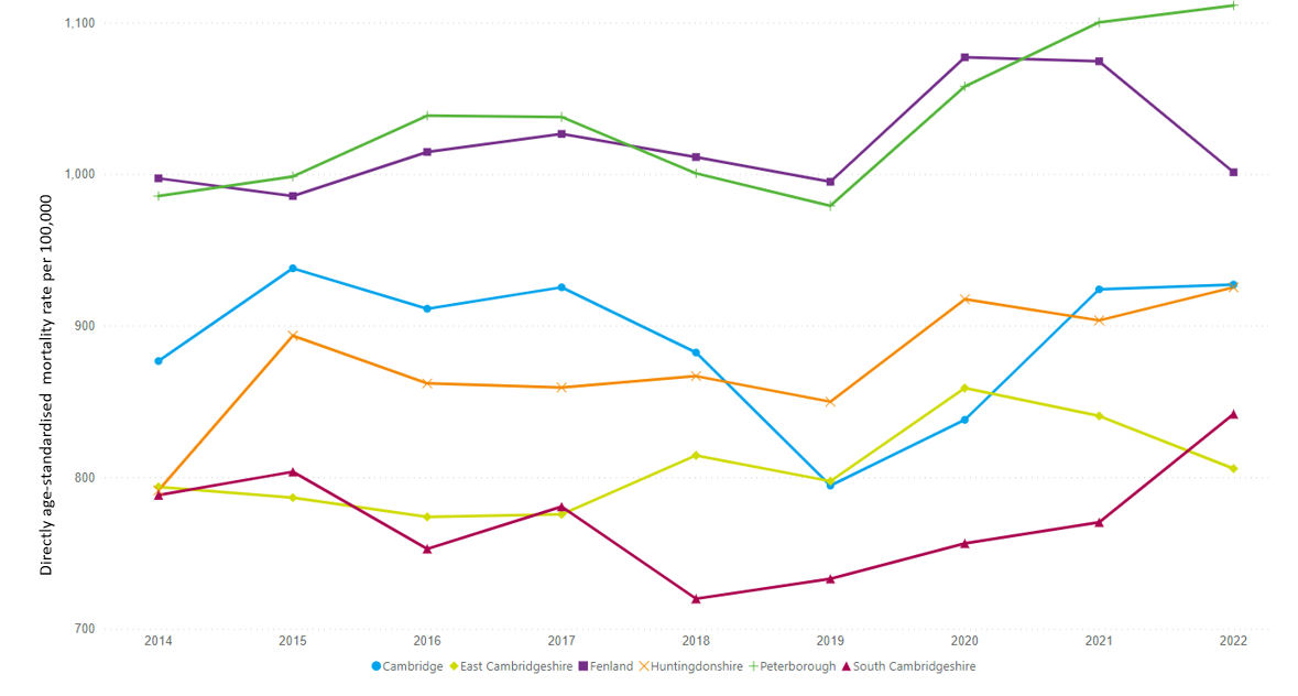
Please note the figures in this graph for 2021 will not match exactly to the 2021 all age all cause mortality rates presented in the interactive dashboard at the top of this page; see note below for more information.
Note on rate calculations.
Rates are calculated using the number of deaths and the number of people in the whole population. Number of deaths is accurate, however the number of people in the whole population is more of an estimate. The trend data uses estimates of the population in previous years (produced by the Office for National Statistics) but these estimates do not take account of the most recent Census in 2021 and are now known to underestimate the population in Cambridgeshire and Peterborough which grew more than the ONS predicted. As such the values given for rates are likely to be artificially high, particularly in the later part of the period 2011-2021. We will update this trend database when more accurate estimates covering the 2011-2021 period are available; please contact us if you would like to know more.